

Discover critical UI/UX and responsive design standards for digital catalogs. Learn optimal image sizes, color usage, and why WebP and MP4/WebM elevate performance.
Catalogs are a universal element in the marketing strategies of many organizations and stand as one of the most effective channels for disseminating information regarding their products and services. Designing a catalog should not be a daunting challenge; however, today's hurdle lies in adapting it to a constantly shifting marketing landscape. Your catalogs must be a fusion of your target market insight and your creative vision. Many companies search for the cheapest pricing or even free catalog design services. Yet, considering the sheer importance of this asset, can such an approach yield desired results?
Here is a compiled set of catalog design recommendations you must know before designing or ordering one. Being fully aware of these essential elements and tips helps reinforce the realization that investing in critical requirements is a necessity, not an extravagance. Adhering to these principles is mandatory—even for an agency offering to design your catalog for free.
Before diving into the design phase, define your audience clearly. Some businesses might use catalogs to target specific, niche consumers (B2C), while Business-to-Business (B2B) catalogs are typically tailored for corporate decision-makers responsible for larger volume procurement. A B2C catalog generally highlights individual products, their value proposition, and the ways they can enhance a customer's life. The latter focuses heavily on products or services that deliver a tangible commercial impact.
Responsive Design for Digital Content
A catalog is a visual asset that showcases your products or services to prospective customers. This tool must be engineered to the highest standards, conveying every feature of your product or service to the client in comprehensive detail. Your potential clients should see a concise profile or description of your organization's background, followed by a portfolio. Granted, there are no rigid rules governing how the layout must look. The arrangement of content on catalog pages, descriptions, and other elements depends strictly on your product type, brand approach, and marketing strategy. However, specific core elements and guidelines exist that will heavily drive your success in this endeavor.
What is Responsive Design and How Does it Impact Digital Catalog Formats?
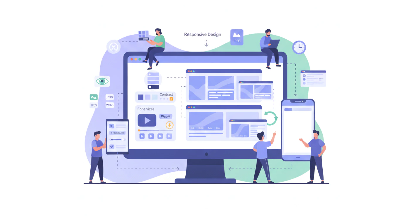
Responsive Design is a foundational UI/UX principle in digital catalog creation. In virtual spaces, websites, and applications, this design approach ensures that every single element embedded within a page dynamically adapts to match the screen size of the user's device.
In other words, in responsive design, the device's viewport serves as the baseline for the architecture. Every page component—ranging from font scaling and text blocks to the sequence and dimensions of displayed images—is engineered and positioned based on desktop, tablet, and mobile displays.
Consequently, when a digital catalog is constructed following responsive standards, all visitors can effortlessly absorb your content regardless of the screen size they use to view it. Every piece of your content displays exactly as you intended. Furthermore, responsive design ultimately drives the user interface (UI) and user experience (UX) growth of your digital catalog.
Below, we detail the core standards of responsive design.
Standard Image Sizes for Responsive Design
As previously noted, the goal of responsive design is the accurate rendering of diverse elements across varying viewports. Therefore, three distinct image sizes are mapped to three general display tiers:
- Small image dimensions: For displays smaller than 640px
- Medium image dimensions: For displays between 641px to 1007px
- Large image dimensions: For displays equal to or larger than 1008px
Standard Font Sizes for Responsive Design
Unlike imagery, standard text sizing in responsive design operates on a different logic. Under fluid design principles, it is highly recommended to use relative units (such as em or rem) rather than absolute pixels. This is because relative units dynamically scale text sizes based on the browser's default sizing or the master template's baseline configuration.
For instance, header text can be defined as twice the size of the default body text font. Alternatively, media queries can be applied to decrease text size by X pixels on viewports narrower than a specific width, and increase it by X pixels on wider screens.

Crucial Tips for Color Application in Digital Catalog Design
Human emotions are deeply impacted by colors, and every shade exerts a distinct influence on a person's mood. Since the ultimate objective of a digital catalog is to influence the minds of clients and audiences, the impact of color within a digital catalog structure cannot be ignored.
Color utilization represents another vital UI/UX principle in digital catalog design, which is the focus of this section.
How Does Color Harmony Maximize the Impact of a Digital Catalog?
The composition, interaction, and balance of colors within a creative workspace is called "color harmony." It applies across numerous creative industries, such as fine arts, graphic design, interior decorating, and fashion.
Color harmony can be broadly categorized into two primary types:
- Analogous Harmony: This involves utilizing colors that sit adjacent to one another on the color wheel—for example, combining blue, purple, and green. The final output of such combinations is typically soft, fluid, and cohesive, instilling a sense of tranquility in the viewer.
- Complementary Harmony: This is the exact antithesis of the previous concept; it entails using colors that sit directly opposite each other on the color wheel, such as pairing blue with orange. The strategic function of this harmony is to inject striking contrast and diversity into a design layout.
Therefore, when establishing your digital catalog format, you should never randomly pick colors; instead, the emotional response of the audience to specific palettes must serve as your design compass.
The Concept of Color Contrast
Color contrast is a core design pillar. It refers to placing two opposing or complementary colors right next to each other (i.e., colors facing each other on the color wheel). This achieves the highest possible level of visual impact and distinction. For example, we know that blue and orange, red and green, or yellow and purple are contrasting sets. When deployed side-by-side, each shade drastically accentuates its counterpart.
Thus, the goal of color contrast is to create differentiation and capture user attention. However, it must be noted that excessive contrast can make the final imagery look jarring and unappealing to the eye. This is why professional designers typically anchor their layouts with a single dominant base color, applying the contrasting shade exclusively to emphasize and draw focus to specific callouts.
Color contrast manifests in several distinct types:
- Contrast of Hue: Driven by the distinction between pure, saturated colors.
- Light-Dark Contrast: Created by the juxtaposition of light and dark shades or values.
- Cold-Warm Contrast: Established by pairing warm tones with cool tones.
- Complementary Contrast: Triggered by opposing colors on the color wheel.
- Simultaneous Contrast: The visual phenomenon where neighboring colors dynamically alter how each other is perceived.
- Contrast of Quality: Generated by variations in color saturation and purity.
- Contrast of Quantity: Determined by the relative surface area size and scale allocated to two or more colors.
Design Standards for Visually Impaired Users
These standards consist of web and product principles built to establish and enhance proper accessibility for individuals with limited or low vision. They are widely implemented across disciplines like architecture, interior layout, product engineering, and web development.
Below are two of the most critical design standards for visually impaired individuals that are exceptionally functional in digital catalog design:
- Color and Contrast: Low-vision individuals identify distinct objects by discerning variances in light and color. Therefore, it is highly recommended to deploy high-contrast colors while strictly avoiding reflective palettes that cause glare or light bouncing.
- Audio Integration: It is wise to incorporate audio capabilities when formatting your digital catalog. This enables visually impaired individuals to listen to your promotional content and seamlessly contact your business if needed.

The Significance of Typography in Digital Catalog Design
A font is a powerful medium for transmitting emotion through written language. Its application within a design must be executed so that the entire layout retains structural harmony while simultaneously achieving specific strategic goals—which, in this context, is captivating the digital catalog audience. In reality, you must avoid over-cluttering a layout with an excessive variety of fonts and text treatments. Never forget that true beauty lies in simplicity.
Selecting the right typeface is one of the most critical UI/UX principles in digital catalog design—a topic we explore thoroughly in a dedicated separate article.
Choosing the Right Image Dimensions and Formats in Digital Catalog Design
Selecting the appropriate dimensions and file formats for your visual assets is another cornerstone of digital catalog UI/UX. Your business catalog must feature high-quality photography of your products and services. Stellar images drive sales by making your inventory significantly more alluring. Photographing high-value items requires the eye of skilled, seasoned commercial photographers. Ensure all photos feature optimal lighting and crisp, high resolution.
The Best Image Format for Digital Content
Web design utilizes a wide variety of image extensions, including JPG, JPEG, PNG, SVG, and more. However, the WebP format stands out as one of the most popular. Developed by Google, this format utilizes highly advanced compression algorithms to dramatically reduce image file size while perfectly retaining visual quality.
WebP supports both lossy and lossless compression architectures, making it fully capable of rendering transparent backgrounds and rich animated sequences.
When comparing WebP to JPG—which is one of the most universally utilized legacy formats—WebP delivers the following clear advantages over JPG:
- Significantly lower file sizes.
- Superior visual clarity and sharpness.
- Native support for transparent backgrounds and animations.
- • Dual-engine support for both lossless and lossy compression.
Leveraging Whitespace in Digital Catalog Design
When designing your digital catalog, the strategic use of empty spaces (whitespace) is absolutely paramount. It ensures catalog pages look immaculate, organized, and inviting to your audience. Proper layout pacing and spatial management assist users in digesting your marketing message far more smoothly.
Furthermore, you must exercise precision and delicacy when arranging content blocks. Avoid cramming every square inch of page real estate with data, keeping in mind that the vast majority of consumers view your digital assets on mobile devices. If a digital catalog page is excessively chaotic, the user becomes disoriented, which directly diminishes your conversion rate.
On the flip side, because designing a digital catalog on the Lenus platform frees you from page count restrictions—meaning you never have to worry about inflating print or distribution overhead—there is no need to skimp on whitespace. However, going overboard is equally discouraged; a catalog with a bloated page count will cause users to abandon flipping through the document altogether.
Therefore, when engineering a digital catalog, you must strike a balance, arranging all products and services cohesively so the final output feels neither crowded nor fragmented. If your catalog spans an incredibly diverse array of items, it is highly recommended to categorize them first, then deploy a standalone, dedicated catalog for each specific segment.

Integrating Video into Digital Catalog Design
Deploying the correct video file formats is widely recognized as one of the most impactful UI/UX methodologies in digital catalog design. Across several articles, we have emphasized that a core benefit of using the Lenus platform is the seamless ability to embed native video formats directly within your digital content layers. But is just any video format acceptable for a catalog or digital asset?
The Best Video Format for Digital Content
Every video extension carries its own unique pros and cons, each suited to different deployment scenarios. However, when taking a holistic look at how to select the absolute best video format for digital content, you should evaluate the following core variables:
- Video Quality:Certain video formats yield drastically higher fidelity and sharpness compared to others. If your digital content’s core objective is to showcase intricate engineering details, high-fidelity containers are ideal. For instance, a major benefit of the MKV format is its ability to bundle high-definition visuals alongside multi-channel audio tracks.
- File Size:Some video extensions yield much tighter compression, making them better suited for web streaming and efficient storage. For example, the MP4 format occupies significantly less disk space than competing extensions while maintaining exceptional quality.
- Compatibility:Certain video extensions offer near-universal compatibility across diverse hardware, media software, and web platforms. The MP4 format, for instance, is an international standard natively supported across all web browsers, smartphones, smart TVs, and video-sharing networks.
Weighing these factors, the MP4 format emerges as one of the definitive best video formats for digital content. It strikes an optimal balance by conserving storage space while retaining stellar quality and offering unparalleled global compatibility. Nevertheless, one cannot claim that MP4 is the absolute best choice for every single scenario; depending on specific technical parameters, formats like MKV, WebM, AVCHD, FLV, MOV, WMV, or AVI may prove more appropriate.
The WebM Format: A Powerful Alternative to MP4
WebM is an open-source, royalty-free video container engineered specifically for the modern web environment. Utilizing a container architecture closely mirrored after MKV, it seamlessly houses both rich video and audio data streams. WebM originally relied on VP8 and Vorbis codecs for audio/video compression, but has since been upgraded to leverage highly advanced VP9 and Opus codecs since 2013.
Advantages of the WebM Format:
- High Quality:WebM delivers stellar video fidelity, preserving rich details and deep, vibrant color palettes.
- Low File Size:WebM files are significantly more compact than many legacy video formats, making them optimized for web transmission and seamless browser streaming.
- Broad Browser Compatibility:WebM is natively supported across all modern web browsers, including Google Chrome, Opera, Firefox, and Microsoft Edge. Additionally, leading multimedia applications such as VLC, MPlayer, KMPlayer, and Miro offer native playback.
Disadvantages of the WebM Format:
- Inconsistent Ecosystem Support:Because WebM lacks native out-of-the-box support on certain popular devices, software tools, and ecosystems (such as legacy versions of Apple's Safari browser on Mac, iOS devices, Adobe Premiere, and specific video hosting sites), it is critical to keep this limitation in mind during your digital content asset creation phase to avoid technical bottlenecks. However, the surging growth of this format points to these restrictions dissolving in the near future.
- Transcoding Requirements:To view or edit WebM files on non-compatible legacy devices and software suites, the video must first be transcoded into alternative formats like MP4, AVI, or MOV. This process is time-consuming and risks introducing compression artifacts or quality degradation.


