

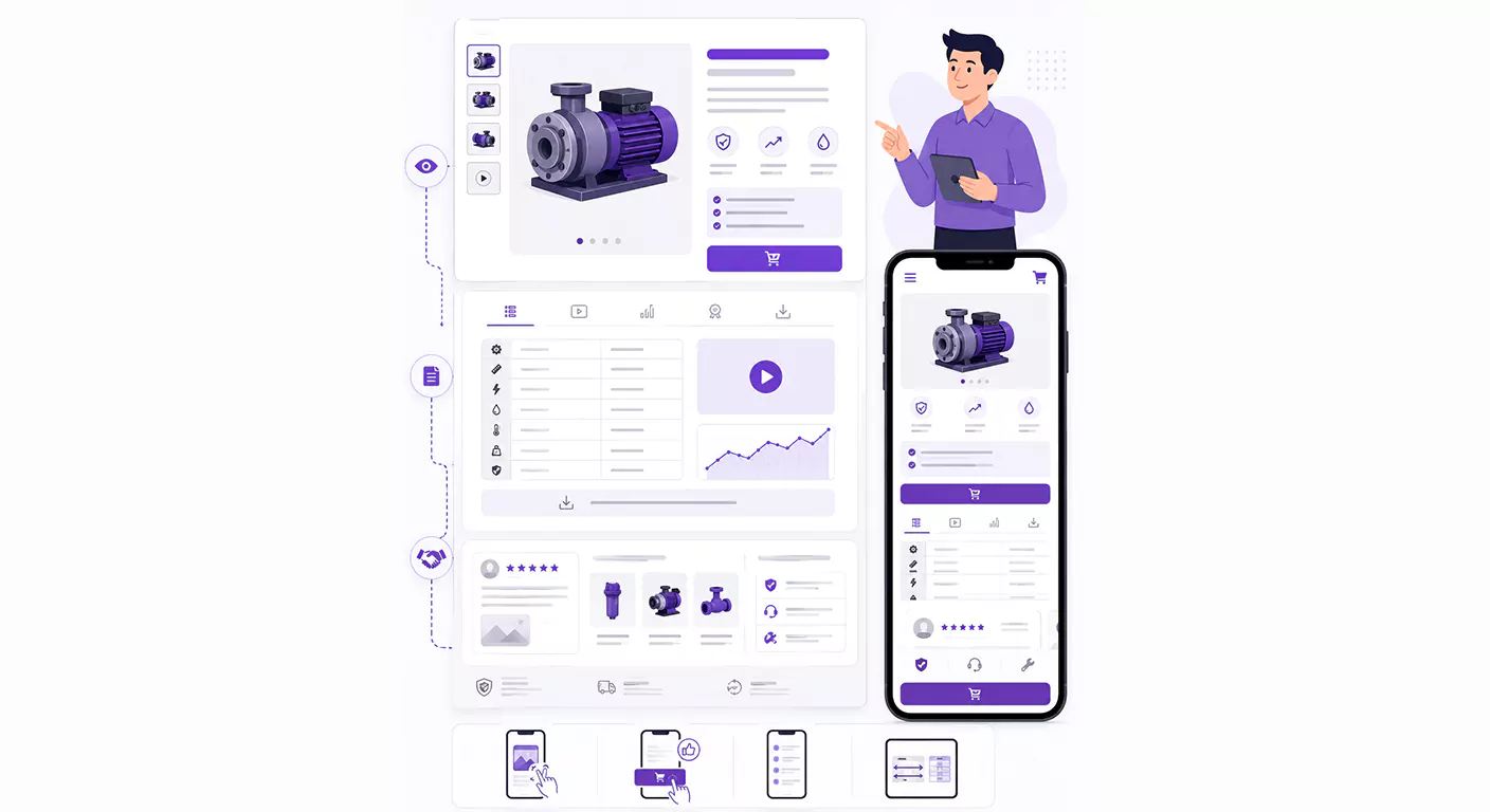
Information Architecture: The Three Main Pillars of a Product Page
Every successful product page must rapidly communicate three pillars of information to the user:
A) Above the Fold
This is the area visible without scrolling, which must instantly answer the user's core questions.
- Essential Elements: Product name, high-quality featured image (gallery), a summary of core benefits, and the primary CTA (call to action), which must be effortlessly accessible.
B) The Midsection (Detailed Information)
This section caters to expert users who are searching for deeper specifications.
- Essential Elements: Technical specification tables (in a comparable format), product demonstration videos, performance charts, and certifications.
C) The Bottom of the Page (Trust & Support)
This area builds trust and resolves any final doubts.
- Essential Elements: User reviews and feedback, related or complementary products (Cross-Sell), and warranty and support details.
Visual Hierarchy Techniques to Boost Conversions
The design must draw the user's eye directly toward the CTA.
A) The "F-Pattern" and "Z-Pattern" Principles
- In Right-to-Left (RTL) languages like Persian, users typically track pages following Z or F visual patterns. Position your primary CTA at a point where the user's eye naturally lands (such as the bottom-right corner of the Above the Fold section).
- Technique: Utilize negative space (whitespace) to isolate the CTA from other content, making it pop out instantly.
B) Strategic Use of Images and Animation
The main image must be the first element noticed. If using an animation or a 360-degree rotation, place it within the primary gallery
- Technique: Ensure images are properly compressed and optimized for mobile devices so that loading speeds are never sacrificed for visual aesthetics
C) Managing Technical Tables
Design technical specification tables to be collapsible so they do not clutter the page. For highly specialized details, provide a "Download Complete Technical Specs (PDF/Excel)" button.
Mobile-First Layout Optimization
Since the vast majority of digital traffic originates from mobile devices, layouts must be designed for these screens first.
| Item | Importance on Mobile | Design Considerations |
|---|---|---|
| Product Images | Highly Critical | Must be displayed full-width, with smooth and easy zoom functionality. |
| CTA | Most Critical | The primary CTA button must be "sticky," remaining visible as the user scrolls. |
| Description Text | Medium | Content should be presented using bulleted lists and short paragraphs. |
| Specification Tables | Challenging | Must be horizontally scrollable or reformatted vertically (with each attribute on a separate row). |
Final Words
The product page in a smart catalog is the ultimate battlefield for customer conversion. The success of this page hinges on intentional layout design. By organizing information hierarchically (from top to bottom), implementing visual hierarchy techniques, and ensuring a flawless mobile user experience, you can craft a powerful layout that seamlessly transitions users from curiosity to decision-making and action (clicking the CTA).


